ShopDreamUp AI ArtDreamUp
Deviation Actions


Suggested Deviants

![[STEPS] Zecora Fantasy - Patreon Reward - Commissi](https://images-wixmp-ed30a86b8c4ca887773594c2.wixmp.com/f/6d1789b1-3864-4096-a569-a9378f5da894/dgr5b46-878f761a-165f-4316-86cb-06a74d62bfe4.jpg/v1/crop/w_92,h_92,x_26,y_0,scl_0.045009784735812,q_70,strp/_steps__zecora_fantasy___patreon_reward___commissi_by_ladykraken_dgr5b46-92s.jpg?token=eyJ0eXAiOiJKV1QiLCJhbGciOiJIUzI1NiJ9.eyJzdWIiOiJ1cm46YXBwOjdlMGQxODg5ODIyNjQzNzNhNWYwZDQxNWVhMGQyNmUwIiwiaXNzIjoidXJuOmFwcDo3ZTBkMTg4OTgyMjY0MzczYTVmMGQ0MTVlYTBkMjZlMCIsIm9iaiI6W1t7ImhlaWdodCI6Ijw9NjA3IiwicGF0aCI6IlwvZlwvNmQxNzg5YjEtMzg2NC00MDk2LWE1NjktYTkzNzhmNWRhODk0XC9kZ3I1YjQ2LTg3OGY3NjFhLTE2NWYtNDMxNi04NmNiLTA2YTc0ZDYyYmZlNC5qcGciLCJ3aWR0aCI6Ijw9MTI4MCJ9XV0sImF1ZCI6WyJ1cm46c2VydmljZTppbWFnZS5vcGVyYXRpb25zIl19.JKyJYDvvkqMQJqqkgwo6b7Eh0RLKjKjkCfEqlU9npB4)

Suggested Collections


You Might Like…


Featured in Groups


Description
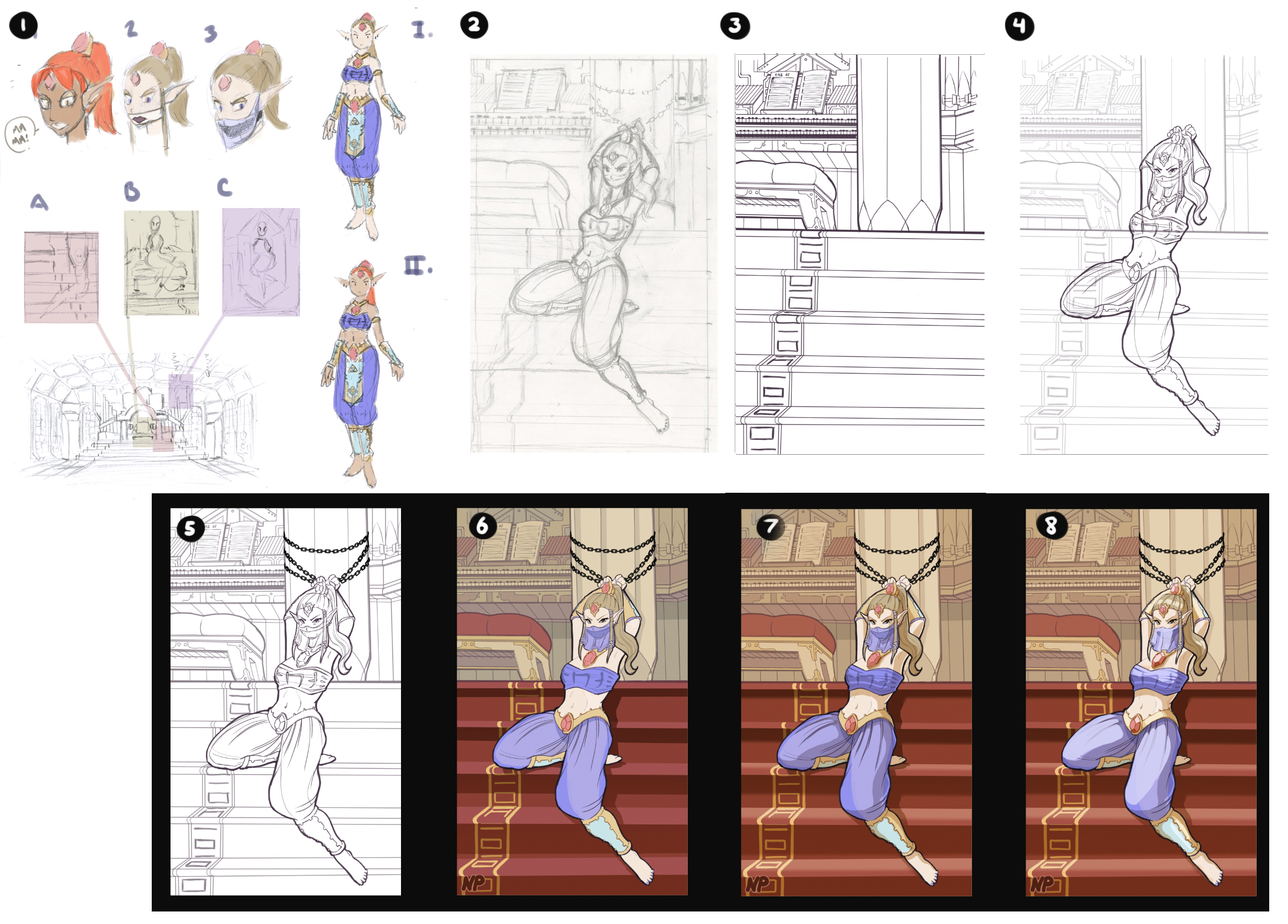
Per request of several people.
1.) I start out drafting things out. The space, the characters, costume design if needed, the concept of the piece, composition, etc. Here's where I make my game plan, and it's an absolutely vital step in MY process. For me, this is the foundation of the entire piece, and it's important to try things and feel it out.
Tech: I sketch out the ideas in pencil and then, if necessary, I dump the sketches into photoshop and throw down some rough colors.
2.) The penciling stage. Here I take the rough I decided on in stage 1 and develop it. My focus here is to work out the perspective, anatomy, proportions. Stuff like that.
Tech: Sometimes I skip this this phase or I combine it with the next stage, the inking phase. It depends on how tight I want the finished illustration. Also, sometimes I'll print out drafted phase on a low opacity and pencil right over the top. The medium is, obviously, pencil.
3.) LA stage background first. This point is all about line quality. Thin lines, thick lines, whatever. I'll also add little details here and there, but the majority of the construction should be worked out by this point. After finishing I'll sometimes add a hard thick outline to the figures and certain parts of the background, like the pillar and the top of the stairs. When doing the thick outline around Zelda I would leave the parts of her body that are directly being hit by light (assuming the light is coming top left) thinner.
Tech: I used to do this all in photoshop on my mac, just using a standard round brush and occasionally dropping the flow. I would try and keep the majority of the linework around a certain size, and then double or triple that size for the thicker outlines. However, after dealing with tendonitis for a few months I switched to using sketchbook pro on my galaxy note and the s pen, using the pencil "brush". If I wasn't dealing with tendonitis I would stick to photoshop on my cintiq (Wacom 32XL or something. It's a big, older model I got off ebay)
4.) LA stage, character. Same as 3.)
5.) La stage, finishing. I've dropped the opacity on the background lineart to let Zelda stand out, and added her chains with a chain brush and then edited them a bit with erasing/ round brush. At this point I'll flip the image back and forth horizontally to see if there are any glaring errors, and use the lasso and transform tools in photoshop to do any fixes. I noticed the background was a little... tilted, so here I've rotated the whole image a bit.
I've also put a white layer behind Zelda using the magic wand selection tool. I always shrink the color layer by a pixel and then refine the edge with the refine edge tool, to make it smooth. This is the foundation for the next stage, and blocks out the background behind zelda so I can "See" the image better before finalizing.
6.) 7.) 8.) Usually what I do is rough in stage 6.) 7.) and 8.) and then go back and tighten everything up once I know it's working.
6.) I'll block in the general colors for the background on one layer and the character on another layer. These layers are usually locked so I don't have to worry about coloring outside the forms. I'll also lock the lineart layers and color the lineart, lighter interior and darker outline, pushing parts of the form that are in direct shadow into total black. Most of Zelda's outline is totall black. Her interior linework is darker hues of the forms they're sitting on, so her skin linework is a darker beighe. Make sense? I'll also put darker linework on areas that I want to emphasize. Around her head, under and around major objects... you can see it under her left shin piece and around her hair and right ear. The linework is set to "normal", as is the color, which situs underneath the lineart layer.
7.) Shading. This is a copied color layer that I leave locked and paint completely white. Then I pull it above the lineart layer and multiply it. Leaving it locked I then color in the shading where I want it. Some of the shading I will have already taken care of in the color layer, like the shadow underneath the organ and the organ bench. All the shading on Zelda, however, is on this seperate "shade" layer.
8.) Highlights, details, and finishing touches. This will be sort of, haphazard. At this point it's figuring out whatever the piece looks like it needs. For instance, the gem highlights are just color picked pinks painted on a normal layer under the Lineart. Her hair and shin armor highlights are done on an overlay layer placed above the lineart. And the highlights on her pants and face scarf are on a "normal" layer above the lineart set at a lower opacity. I also tossed in an orange hue layer behind zelda, that I dropped to a low opacity, to help bring her out and unify the background.
I wish I could say it was a straightforward 8 step process, but it isn't really. Especially as it gets closer to the end, the process will change a bit depending on what I think the project needs. But there you go! Hope someone finds this useful.")
Disclaimer: This won't necessarily make you a better artist, it'll just help you emulate my type of art. If you want to get better, take life drawing clalsses, study master work, learn anatomy. Andrew Loomis's work is where I learned proportions and figure drawing. Art, like any other craft, will evade any three-step-process thinking. It's a craft, and it takes more than just practice: it takes reflection, exposure, and active study. And, it's honestly a life-long journey.
Keep on fighting, fellow artists!
-Heart
1.) I start out drafting things out. The space, the characters, costume design if needed, the concept of the piece, composition, etc. Here's where I make my game plan, and it's an absolutely vital step in MY process. For me, this is the foundation of the entire piece, and it's important to try things and feel it out.
Tech: I sketch out the ideas in pencil and then, if necessary, I dump the sketches into photoshop and throw down some rough colors.
2.) The penciling stage. Here I take the rough I decided on in stage 1 and develop it. My focus here is to work out the perspective, anatomy, proportions. Stuff like that.
Tech: Sometimes I skip this this phase or I combine it with the next stage, the inking phase. It depends on how tight I want the finished illustration. Also, sometimes I'll print out drafted phase on a low opacity and pencil right over the top. The medium is, obviously, pencil.
3.) LA stage background first. This point is all about line quality. Thin lines, thick lines, whatever. I'll also add little details here and there, but the majority of the construction should be worked out by this point. After finishing I'll sometimes add a hard thick outline to the figures and certain parts of the background, like the pillar and the top of the stairs. When doing the thick outline around Zelda I would leave the parts of her body that are directly being hit by light (assuming the light is coming top left) thinner.
Tech: I used to do this all in photoshop on my mac, just using a standard round brush and occasionally dropping the flow. I would try and keep the majority of the linework around a certain size, and then double or triple that size for the thicker outlines. However, after dealing with tendonitis for a few months I switched to using sketchbook pro on my galaxy note and the s pen, using the pencil "brush". If I wasn't dealing with tendonitis I would stick to photoshop on my cintiq (Wacom 32XL or something. It's a big, older model I got off ebay)
4.) LA stage, character. Same as 3.)
5.) La stage, finishing. I've dropped the opacity on the background lineart to let Zelda stand out, and added her chains with a chain brush and then edited them a bit with erasing/ round brush. At this point I'll flip the image back and forth horizontally to see if there are any glaring errors, and use the lasso and transform tools in photoshop to do any fixes. I noticed the background was a little... tilted, so here I've rotated the whole image a bit.
I've also put a white layer behind Zelda using the magic wand selection tool. I always shrink the color layer by a pixel and then refine the edge with the refine edge tool, to make it smooth. This is the foundation for the next stage, and blocks out the background behind zelda so I can "See" the image better before finalizing.
6.) 7.) 8.) Usually what I do is rough in stage 6.) 7.) and 8.) and then go back and tighten everything up once I know it's working.
6.) I'll block in the general colors for the background on one layer and the character on another layer. These layers are usually locked so I don't have to worry about coloring outside the forms. I'll also lock the lineart layers and color the lineart, lighter interior and darker outline, pushing parts of the form that are in direct shadow into total black. Most of Zelda's outline is totall black. Her interior linework is darker hues of the forms they're sitting on, so her skin linework is a darker beighe. Make sense? I'll also put darker linework on areas that I want to emphasize. Around her head, under and around major objects... you can see it under her left shin piece and around her hair and right ear. The linework is set to "normal", as is the color, which situs underneath the lineart layer.
7.) Shading. This is a copied color layer that I leave locked and paint completely white. Then I pull it above the lineart layer and multiply it. Leaving it locked I then color in the shading where I want it. Some of the shading I will have already taken care of in the color layer, like the shadow underneath the organ and the organ bench. All the shading on Zelda, however, is on this seperate "shade" layer.
8.) Highlights, details, and finishing touches. This will be sort of, haphazard. At this point it's figuring out whatever the piece looks like it needs. For instance, the gem highlights are just color picked pinks painted on a normal layer under the Lineart. Her hair and shin armor highlights are done on an overlay layer placed above the lineart. And the highlights on her pants and face scarf are on a "normal" layer above the lineart set at a lower opacity. I also tossed in an orange hue layer behind zelda, that I dropped to a low opacity, to help bring her out and unify the background.
I wish I could say it was a straightforward 8 step process, but it isn't really. Especially as it gets closer to the end, the process will change a bit depending on what I think the project needs. But there you go! Hope someone finds this useful.
Disclaimer: This won't necessarily make you a better artist, it'll just help you emulate my type of art. If you want to get better, take life drawing clalsses, study master work, learn anatomy. Andrew Loomis's work is where I learned proportions and figure drawing. Art, like any other craft, will evade any three-step-process thinking. It's a craft, and it takes more than just practice: it takes reflection, exposure, and active study. And, it's honestly a life-long journey.
Keep on fighting, fellow artists!
-Heart
Image size
2470x1772px 1.67 MB
Comments12
Join the community to add your comment. Already a deviant? Log In
very cool, its always nice to see how awesome artist do things, hopefully i can use some of this to improve my own work ^^